- Duration: 8 weeks
- App Usability Improvements
- High-Fidelity Prototyping & Testing
- User Flow Optimization
- Brand Identity
- Visual Design
0.1 Overview
PunchLab is one of the top boxing workout apps, offering immersive guided training sessions for all skill levels. With a strong market presence and a highly rated user experience, it's a go-to app for boxing enthusiasts. This project focused on refining the appss usability, making it even more efficient, flexible, and user-friendly for a seamless boxing experience.
0.2 The Problem?
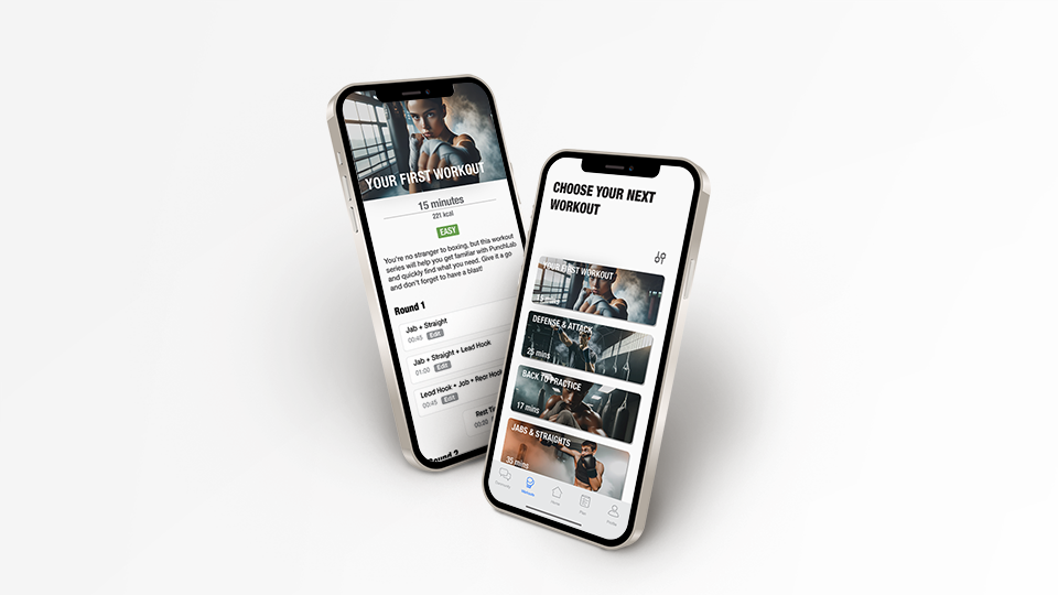
While PunchLab has a strong foundation, user feedback revealed several limitations that impacted the experience. These issues led to frustration and disengagement, making workouts less effective for different user needs:
The app only lets you search by instructor, not by difficulty or time. The user should be able to have all the app workouts in a single list and be able to apply filters to find the perfect workout.
When starting a workout, you can only skip the rounds but not restart them. The user should be able to rewind every exercise.
Rest time between rounds is not adjustable. This is the way the workouts are built but some people need more time. They should be able to adjust a fixed stopwatch instead of having to pause for indefinite time.
0.3 Creative Direction
Punch Lab users have provided negative feedback regarding the lack of available customizable features and reduced flexibility in the workout properties.
By increasing the overall customizable app features and improving flexibility during workouts, alongside enhancing the workout search tool, users will have the ability to tailor their sessions to meet their exact needs and discover workouts that match their specific criteria more quickly. This will not only improve current client retention but also increase customer satisfaction reflected in star reviews.
Understanding the Users
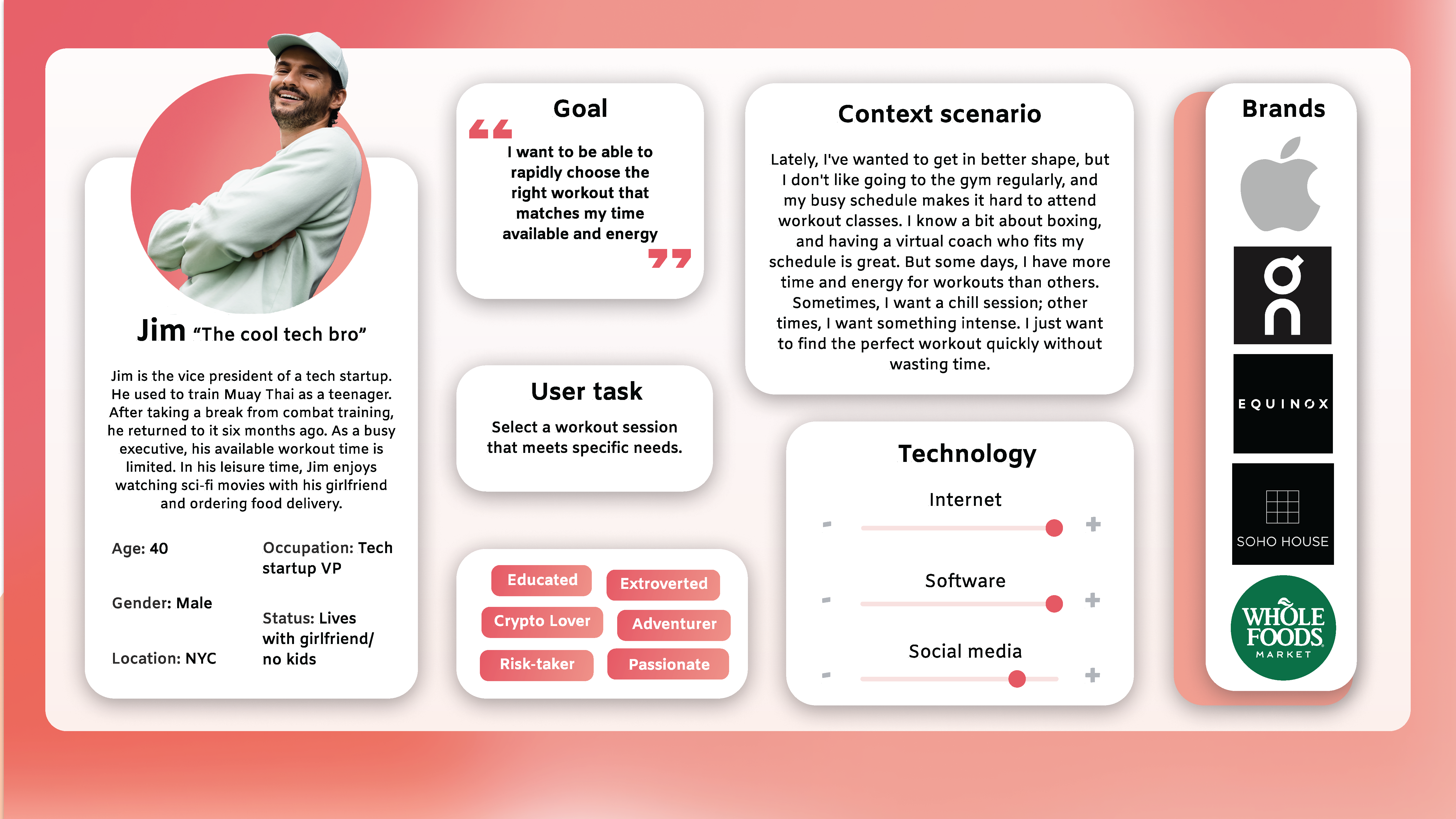
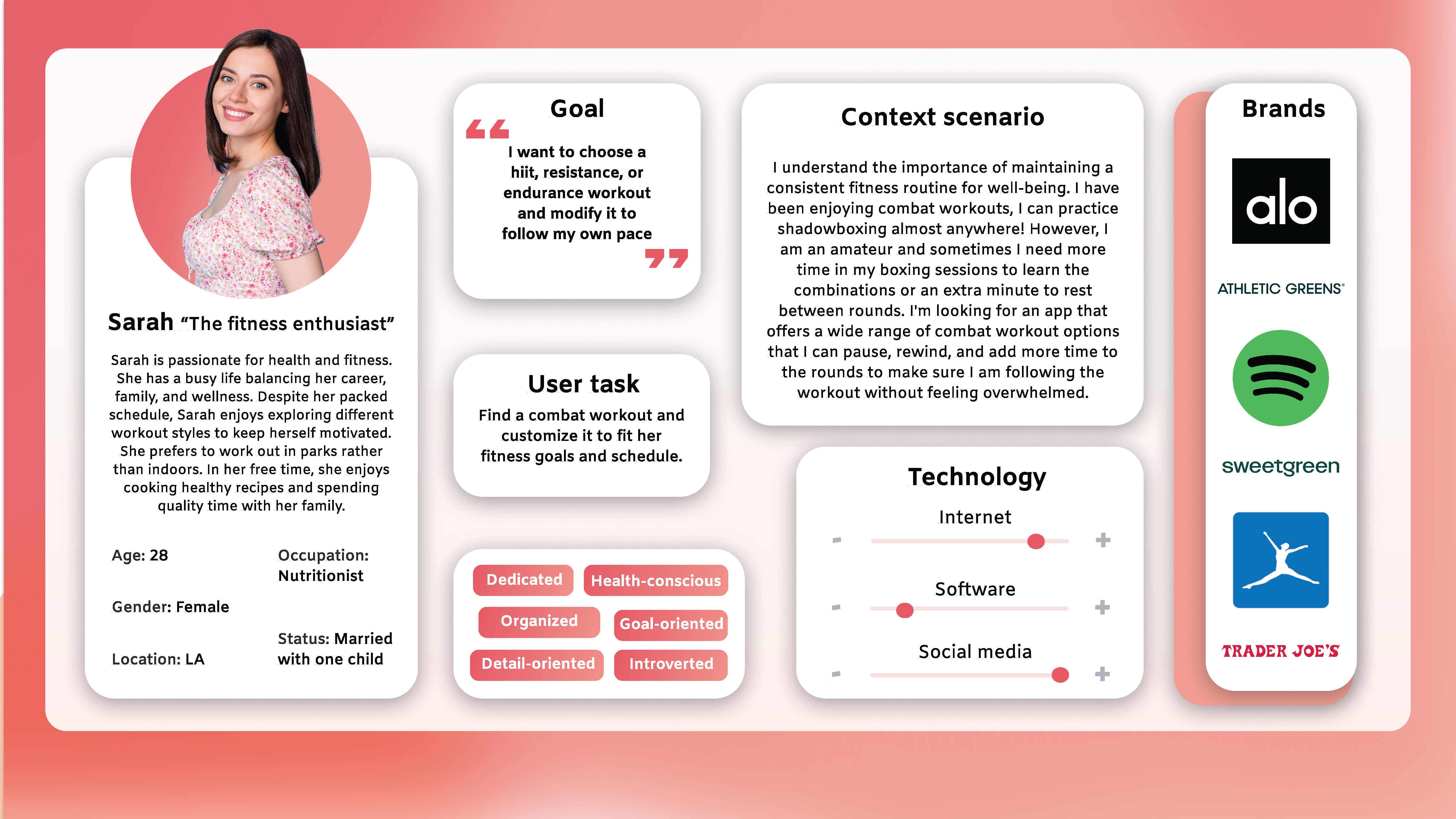
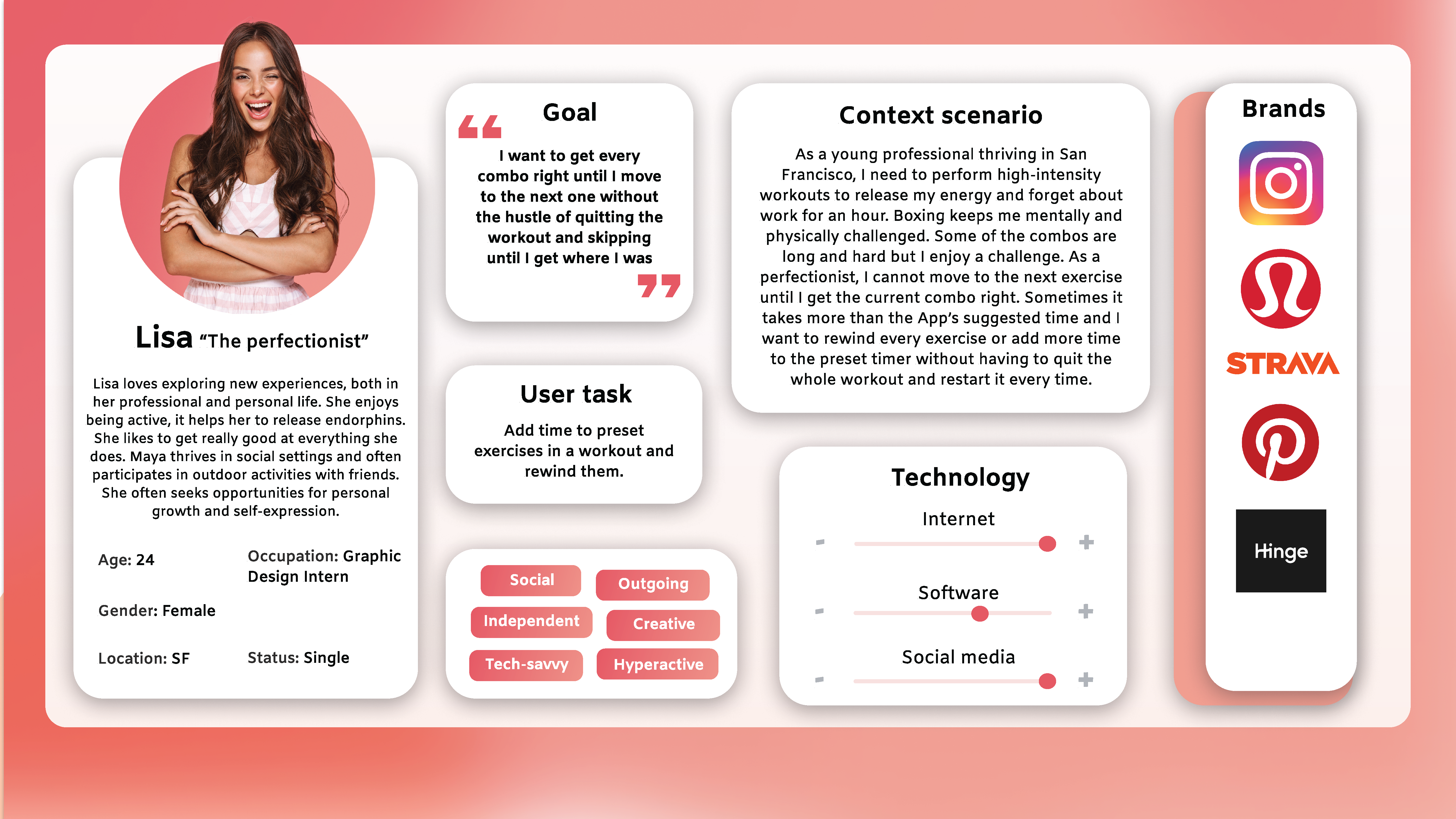
My target audience is full of busy, driven people who want workouts that fit their lives—not the other way around. They're professionals, creatives, and fitness lovers who value quality, convenience, and flexibility. Some are perfectionists who need to master every move, while others just want to find the right workout fast and get it done. Fitness isn't another task for them—it's something that should work for them, seamlessly.
Design Process
User Tasks
Jim — Select a workout session that meets specific needs refining navigation and interaction flow.
Sarah — Find a combat workout and customize it to fit fitness goals and schedule.
Lisa — Add time to preset exercises in a workout and rewind them.
Low-Fidelity & Prototyping
Created paper wireframes for Jim and Sarah to quickly test layout ideas and gather feedback. Also, designed a digital wireframe for Lisa, focusing on refining navigation and interaction flow.
Figma PrototypeHigh-Fidelity & Prototyping
Developed high-fidelity prototypes for all three personas, incorporating refined UI elements, improved workout customization, and intuitive navigation.
Incorporating the feedback from the first testing round, I made snsured the final designs addressed key user pain points, making PunchLab more seamless and adaptable to different training styles.
Jim Prototype Sarah Prototype Lisa PrototypeBrand Behaviors & Product Ethics
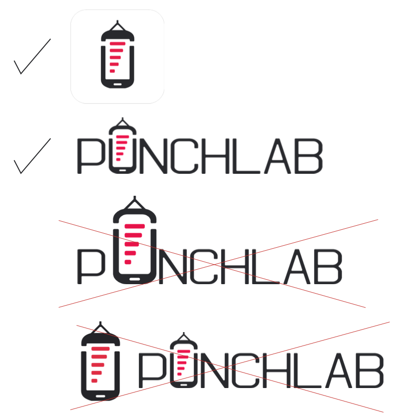
This logo should be consistently used across all platforms. Please utilize only the three designated color variations with their respective background colors as authorized.

Please refrain from modifying the size ratios of the logomark or its combination. Avoid altering the color scheme of the logomark or combination. Do not rotate, skew, or distort the logo in any manner. Only choose one form of logo, do not combine both options.

Structured Grid System
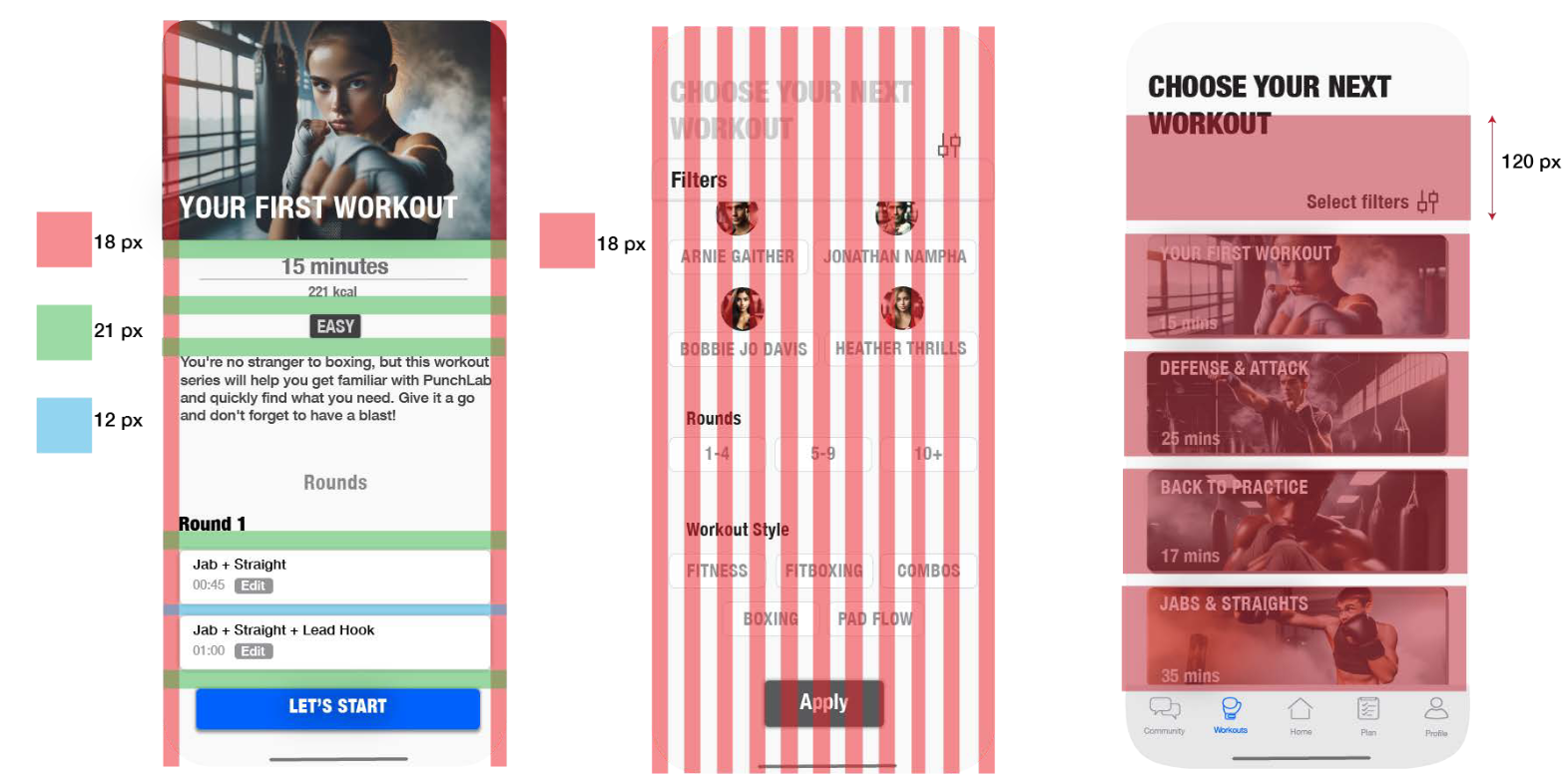
In the process of redesigning the PunchLab app, my focus has been on enhancing user experience through thoughtful design elements. One of the pivotal decisions made was to implement a versatile grid system, incorporating units of 12, 18, 21, and 120 pixels. This strategic choice not only promotes consistency throughout the interface but also significantly enhances navigational ease for users.
Symbols
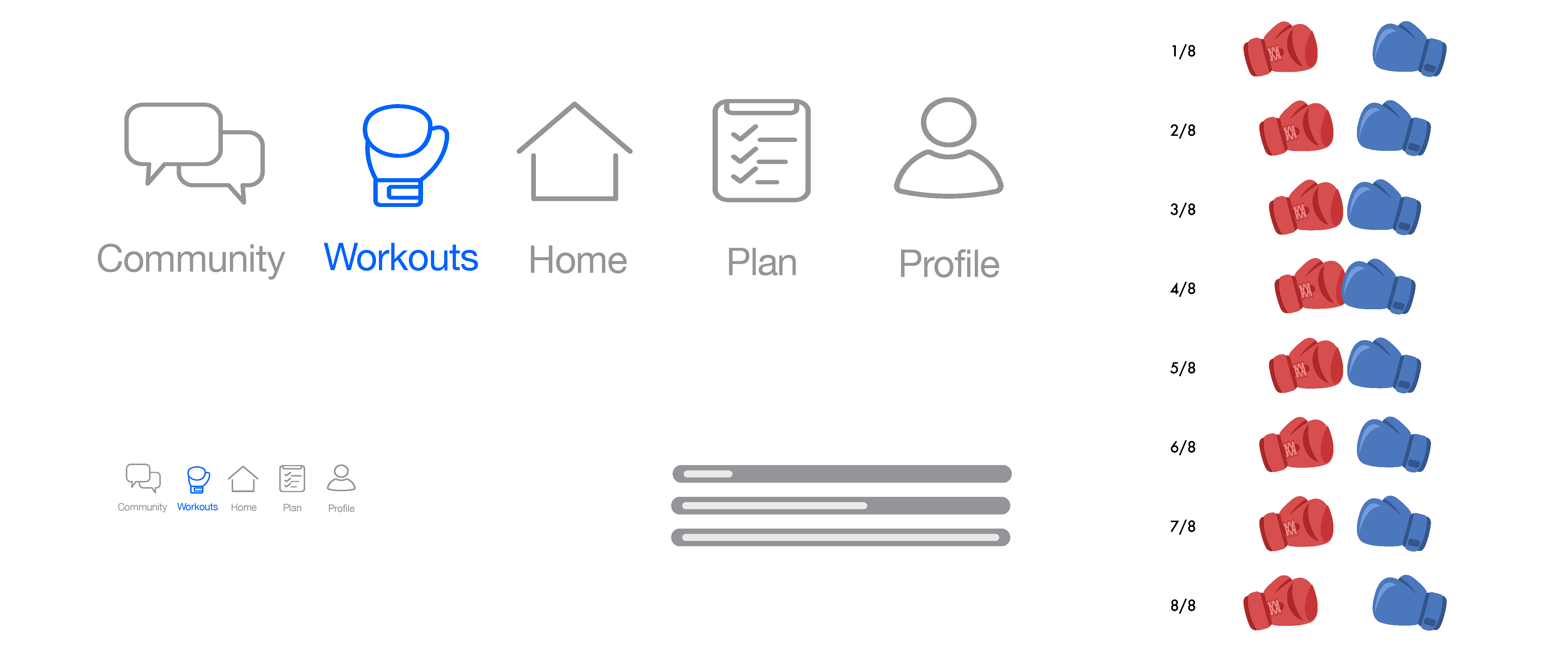
The symbols and icons in the PunchLab app are designed to be simple, clear, and intuitive. Every icon was thoughtfully crafted for easy recognition while keeping a clean, minimal look that enhances the user experience.
Bringing It All Together
This redesign was all about making PunchLab work better for real users. I focused on solving key frustrations—giving people a better way to search for workouts, rewind exercises, and adjust rest times—so they can train the way they want. From user research to prototyping, every decision was made to make the app feel more intuitive, flexible, and seamless. The updated design keeps things simple and easy to navigate while staying true to PunchLab's brand. In the end, it;s not just a better-looking app, it's a better experience for anyone who wants to train smarter.
Read more of my case studies
Let's start working together!
Contact Me