Work · Neareal
UX Design Product Strategy Mobile · iOS 0 → 1

Neareal

Helping shy hearts find real connection.

Role
UX Designer + Product Manager
Timeline
15 weeks
Tools
Figma · FigJam · Adobe After Effects
Platform
iOS Mobile App
Type
Academic Project — Academy of Art University
Neareal app screens
01
Overview

Personal Interest

For me, the most important things in life are human connection and the relationships I build with the people around me. Physical presence, shared space, and face-to-face conversation are irreplaceable — and I wanted to make sure technology didn't erase those moments.

Neareal bridges the gap between how people used to meet — organically, in real life — and how we navigate connection today. It uses technology not as a replacement for human interaction, but as a gateway to it, helping a new generation feel more confident approaching others in person.

"The strongest connections don't live on screens — they're built through real, human closeness."

1 in 3
young adults feel socially anxious in everyday situations
45%
of Gen Z men have never approached someone in person for a date
63%
want clearer social cues to approach others in public places
02
Strategy

The Big Idea

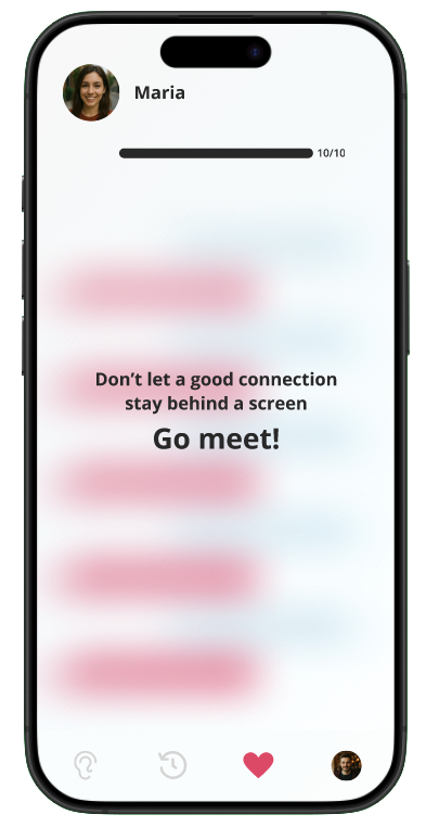
If we're already out living our lives — sitting in a café, browsing in a bookstore, waiting at a bar — and our potential connection is right across from us, why should we miss that chance? Neareal lowers the social friction of initiating real-life interactions and helps users feel confident enough to move from screen to reality.

"Use technology as a bridge — not a barrier — to real human connection."

HMW How might we help Michael navigate public social spaces for dating in a way that reduces awkwardness and increases confidence?

Men are Disillusioned with Dating Apps in the U.S.
Mentor Research Institute — It is hard to build meaningful relationships in the digital dating scene.
[ Article link ↗ ]

The Hidden Psychology Behind the Gen-Z Stare
Narineh Hartoonian, Ph.D., M.S. — Gen Z struggles with face-to-face interaction after the pandemic.
[ Video link ↗ ]

46% of U.S. Adults Experience Loneliness
Giselle Abramovich, Editor-in-Chief, The Cigna Group Newsroom.
[ Article link ↗ ]

03
Research

Audience Research & Persona

I ran interviews and surveys to understand why people feel hesitant about approaching others in real life. Mapping the findings in FigJam helped me spot patterns in needs, pains, and desires, and guided me toward the core problem worth solving.

Michael
28 · Marketing Specialist · San Francisco, CA · Single
Goals
  • Meet potential partners in everyday settings, not just apps
  • Build deeper, more meaningful connections
  • Make dating feel natural — not another task
Pain Points
  • Can't tell when strangers are open to conversation
  • Swipe culture feels transactional and exhausting
  • Unsure how to initiate without being awkward
Quote

"I don't mind dating apps, but I'd rather meet someone in person. The problem is, it's hard to tell when someone's actually open to conversation or just minding their own business."

Lifestyle
  • Live music events · Rooftop bars
  • Co-working spaces · Coffee shops
  • Fitness classes · Book clubs

I interviewed Mayari, 25, a university student in Los Angeles via Zoom, March 2026.

  • Uses dating apps occasionally but finds conversations often feel superficial and the texting never-ending.
  • Feels interested in meeting people in real life but is often unsure if approaching someone would be welcomed.
  • Most meaningful connections have happened through shared environments like events, mutual friends, or hobbies.
  • Social events create better opportunities to meet people, but can still feel awkward or unclear when it comes to romantic intent.

"I enjoy talking with people and depending on the situation most people are often much nicer than we think." — Mayari, 25, Los Angeles

Direct Competitor
Hinge
What it does well
Designed to be deleted — promotes real-world meetings.
Gap
Still entirely swipe-based. Doesn't reduce the anxiety of in-person approach.
Adjacent Competitor
Meetup
What it does well
Facilitates real-world in-person gatherings.
Gap
Requires planning and isn't designed for romantic connection.
The Opportunity
Neareal
What we do differently
Real-time proximity + AI compatibility + limited messaging to build the courage to approach in person. No existing app reduces spontaneous in-person anxiety.
04
Process

Design Process

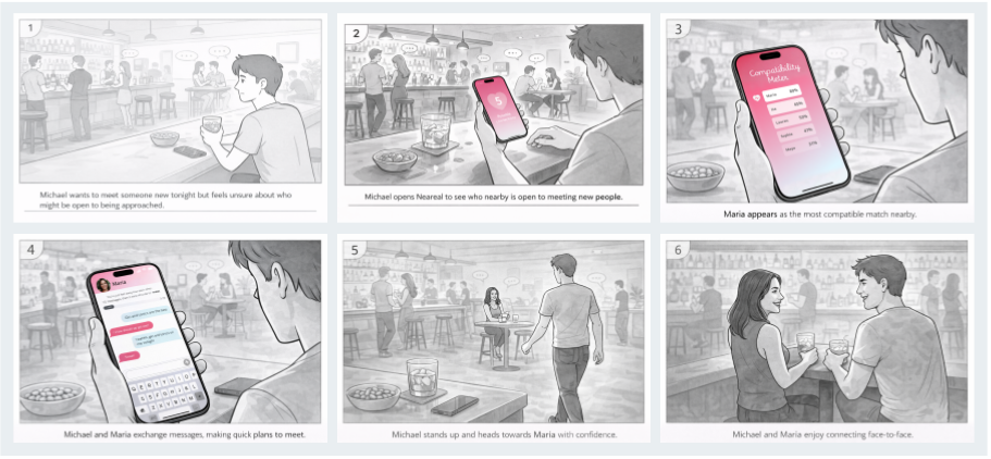
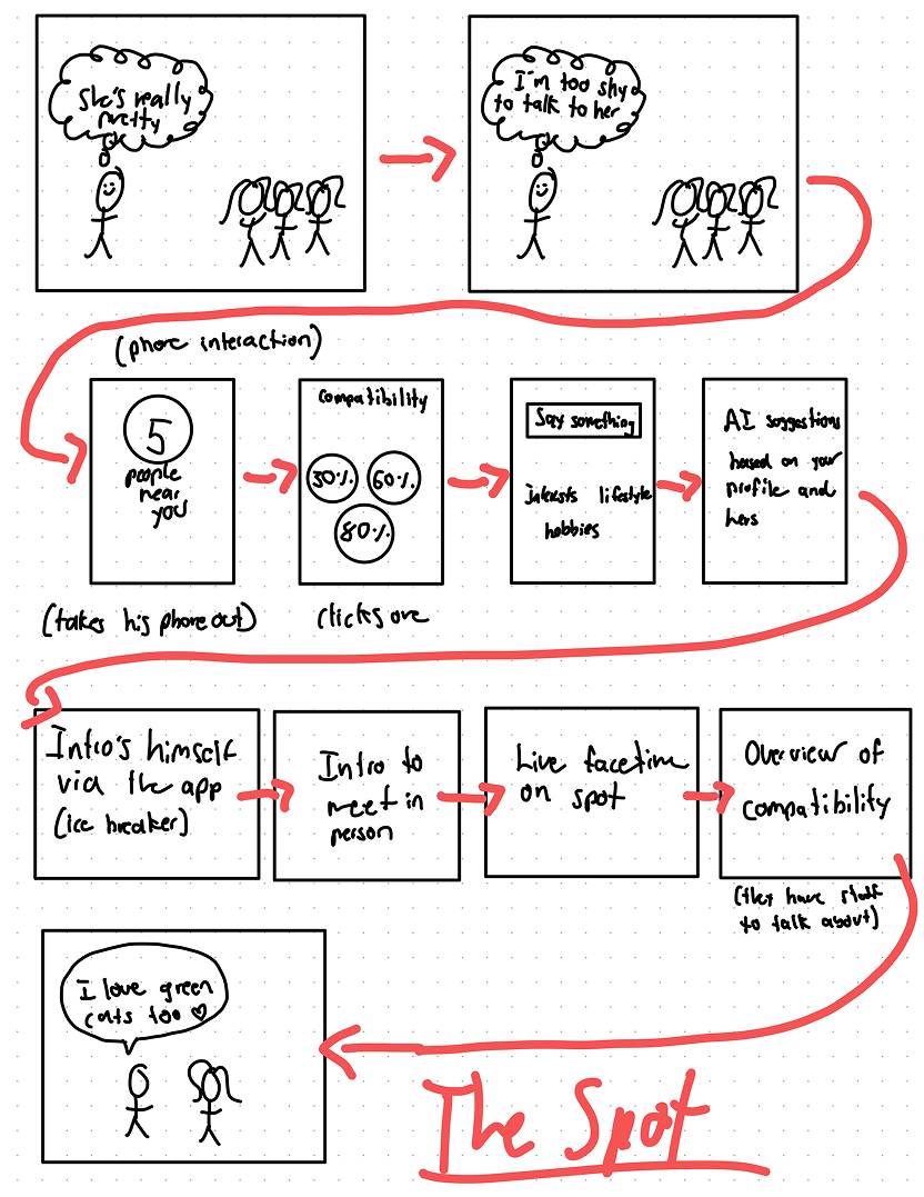
I started with loose storyboards and quick hand-sketched wireframes — not to make them look perfect, but to test flows and iterate fast before committing to the final interface. Creating storyboards helped me step into Michael's shoes and imagine how he would ideally use Neareal day-to-day.

User Storyboard — Michael's Journey
From feeling unsure → to meeting face-to-face
User storyboard: six frames showing Michael at a bar feeling unsure, opening Neareal, seeing Maria as the most compatible match nearby, exchanging quick messages, walking over with confidence, and connecting with her face-to-face.
01
Concept Sketches
Loose hand-sketched storyboards to explore flows quickly. No polish — just speed and iteration.
02
Mid-Fidelity
Digital wireframes exploring layout, IA, and key screens: onboarding, matching, messaging.
03
High-Fidelity
Final screens with Neareal's design system — pink gradient, Open Sans + Borel, warm supportive voice.

I defined three core task flows before moving to high-fidelity:

01
Meet AI Coach
"Hello Michael. I'm here to help build a profile that actually feels like you."
02
Speak Freely
Voice input — no typing pressure. Deep answers stay private.
03
Review Profile
Coach generates bio + 5 personality words. Michael can edit.
04
Public Tease
Short intro shown to connections — just enough to spark curiosity.
01
See Who's Around
Opens app at venue. Heart shows possible connections nearby.
02
Compatibility Meter
AI ranks users by compatibility based on coach conversation.
03
Read Their Bio
Short honest intro + 5 words. Just enough to feel the spark.
04
Break the Ice → Go Meet
Suggested openers. 10 messages max — then go meet in person.
01
You Met
Too present to ask for their number? App logs who you connected with and where.
02
Get a Reminder
Photo + location where you met. Just enough to refresh memory.
03
Request Info
Send a reconnect request. They get notified and choose to share contact.
04
Connect Outside
If mutual: phone, Instagram, Spotify — whatever they choose to share.
05
Testing

Testing & Feedback

I tested low-fidelity prototypes with users to quickly spot friction points and gather first impressions. Two significant issues surfaced — one visual, one tonal — and both required a full rethink.

Testing Details: [ 5 testers · usability testing ]
Iteration 01 Layout — Compatibility Meter
Problem
Users found the floating circles confusing. The layout felt chaotic and the meaning behind the percentages wasn't clear.
How I Fixed It
Replaced circles with a clean, ranked list. Added color highlight + icon to spotlight the top match, making it instantly recognizable.
Result
A clearer, more intuitive interface. Users instantly understood who to focus on — zero confusion in follow-up tests.
Before
After
Iteration 02 Voice & Tone — Go Meet Prompt
Problem
Users hesitated when it was time to meet. The app's tone felt too neutral — missing warmth and reassurance needed to push someone out of their comfort zone.
How I Fixed It
Reworked the copy across the entire app to sound like a supportive friend: casual, encouraging, and anxiety-free. "Don't let a good connection stay behind a screen — Go meet!"
Result
A consistent, friendly tone that made users feel more at ease — and more excited to connect in real life.
Before
After
06
Deliverables

Final Deliverables

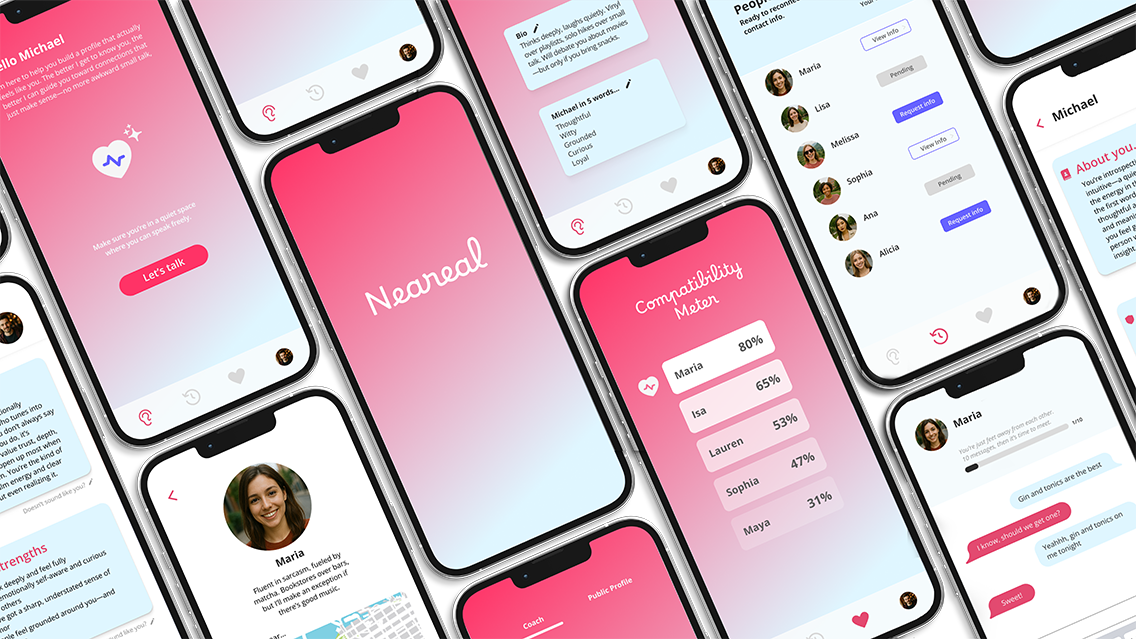
Two deliverables: an interactive Figma prototype walking through all three task flows, and a promotional video built in Adobe After Effects to show the app's spirit in motion.

📱
Interactive Prototype
Full Figma prototype covering AI coach onboarding, proximity discovery, compatibility meter, limited messaging, and the Reconnect screen. Includes a Task Title Card at the start of each flow.
View Prototype ↗
🎬
Promotional Video
A motion design piece built in Adobe After Effects — combining storytelling and animation to show how Neareal encourages people to move from messaging to meeting in real life.
Watch Video ↗

After testing and refining the lo-fi prototypes, I established a visual system to guide the hi-fi designs. The Neareal design system is warm, playful, and supportive — it had to feel like a friend, not a tool.

  • Typography: Open Sans (body) + Borel (display/script)
  • Primary colors: #E34A70 (pink), #FF3366 (hot pink), #DFF6FF (ice blue), #2D2D2D (charcoal)
  • Voice: Casual, encouraging, anxiety-free. Like a supportive friend who happens to be a great wingperson.
  • Buttons: Rounded pill shape, pink fill — warm and approachable

[ Link to full styleguide in Figma ↗ ]

Adoption & Engagement
Profile completion rate — % who finish AI-coached profile
Profile creation time — avg. time from first open to profile ready
Behavioral Metrics
Open rate at target locations — % who open at social venues
Initiated meetups — % who clicked "Go Meet" or used suggested openers
Repeat usage — users who returned within 7 days
Retention
% of users who reconnect after meeting someone in person
% of users who return after a successful in-person meeting
07
Reflection

What I Learned

01
Design for emotions, not just usability.
Designing for human connection is more complex than designing for task completion. People need to feel safe. Tone and clarity matter as much as layout.
02
Treat people as people — not just users.
Letting go of my assumptions and listening to real user reactions led to better, more empathetic design decisions throughout the project.
03
Technology should enable connection, not replace it.
Neareal's core insight: the best role for technology in dating isn't to find your person — it's to give you the courage and context to approach them yourself.
  • Define clear safety and privacy guidelines for real-world proximity sharing
  • Validate AI coach + compatibility system with real users to ensure comfort and trust
  • Collaborate with engineers and PMs to explore technical feasibility of location + matching
  • A/B test the message-limit mechanic to find the sweet spot between warmup and urgency
  • Explore potential partnerships with local events and venues
Question for Class / Instructor
The Reconnect feature (finding someone after you've already met) felt like the most emotionally resonant part of the product — but also the most technically and ethically complex. Is there a version of this feature that would feel genuinely safe and delightful rather than invasive? How would you approach the privacy/consent design here?